Brand Strategy
AI in Marketing & Branding
The Blanding Problem
What 250+ University Websites Taught Me About Saying Nothing

World-class faculty. Vibrant community. Hands-on learning. Commitment to excellence. Interdisciplinary programs that prepare students for an ever-changing world. Do you know which higher ed I'm referring to? Are you starting to get an idea of whether this might be the right place for you, or your child?
Or is all you hear virtue and prestige signaling, which may be, in part, to justify the soon-to-be-revealed high tuition numbers.
And the cost of all that signaling? Hundreds of higher education institutions have merged towards the bland center of nothingness with the language they use to describe themselves.
I've worked with many colleges and universities, and I can tell you that when you sit down to meet with them, they all talk about how unique and special they are. But finding the words to convey that? Almost impossible, because the pressure to be all things to all people, while sounding prestigious and institutional, wins every time.
So, I built an app called Blanding that scores how generic your website's language actually is. Paste in any .edu URL. It scrapes the homepage and 3 key secondary pages, counts the clichés, runs an AI analysis on writing quality and strategic positioning, and gives you a score out of 100.
It's one thing to read all the posts (including mine) railing against the "blanding." It's another to see it for yourself, from your own institution's content. And maybe it's a little easier to swallow knowing the assessment is coming from a computer, not a human consultant you paid a lot of money only to tell you how poorly you're doing.
I released it to the wild. Users submitted their schools. And the results are not pretty.
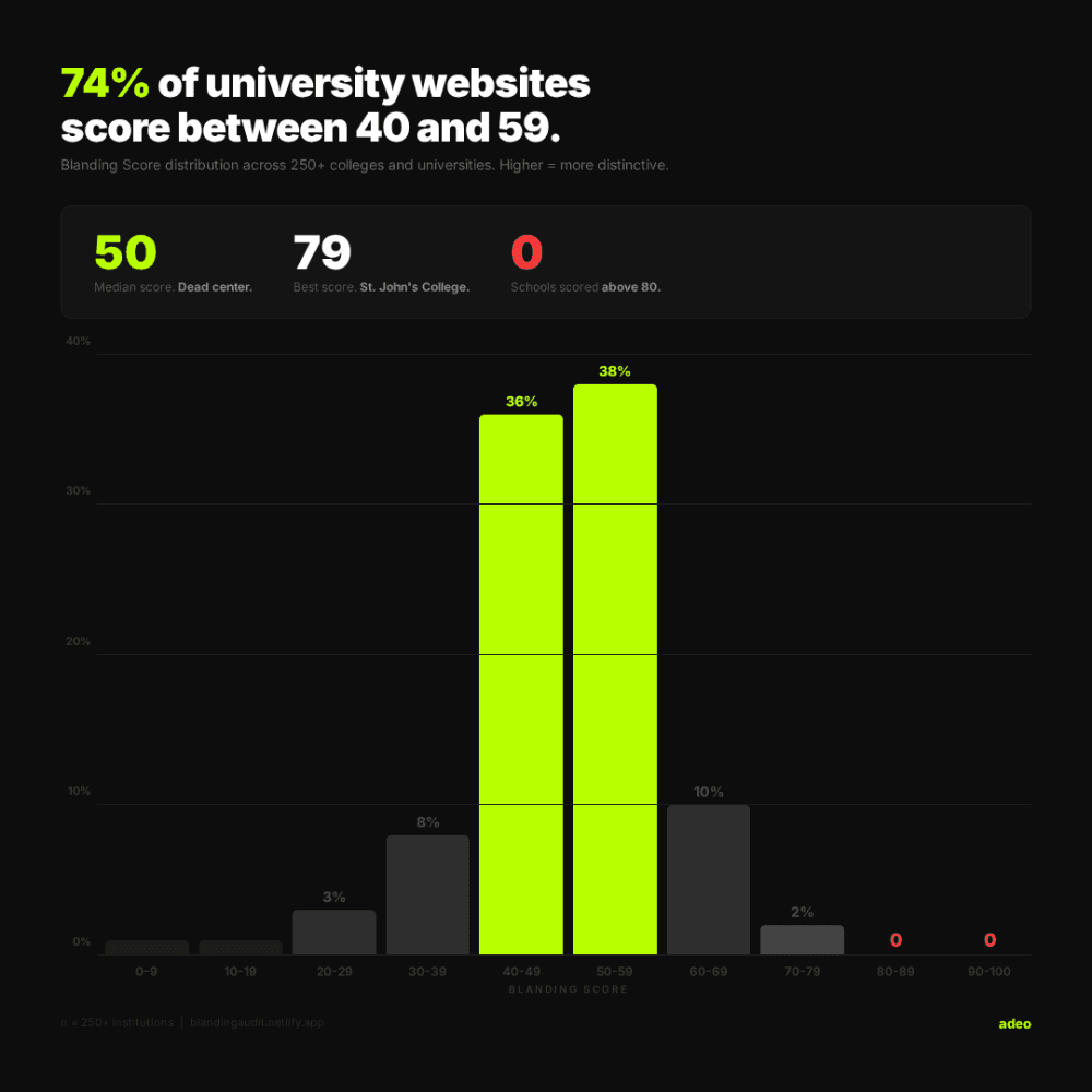
Zero of 250+ schools scored above 80.
The best score in the entire dataset is 79. That's St. John's College, a school with a genuinely unusual curriculum built around Great Books. A place that actually is different.
The median score is 50. Dead center. And 74% of schools cluster between 40 and 59. Almost three-quarters of university websites are statistically indistinguishable from each other in terms of brand voice.
MIT scored 76, which isn't surprising. They had exactly 2 clichés detected across their entire site. The school with the most? Over 150.
I score three things separately: language quality (how well is the writing itself?), strategic positioning (does the site answer "why here?"), and cliché density (how much filler language?).
The averages tell an interesting story. Language scores averaged 54. Strategy averaged 47. Schools are slightly better at writing decent sentences than they are at actually saying something meaningful. They can construct a paragraph. They just can't tell you why their school is the one.
And some gaps were dramatic. I found schools with a 30, 40, or even 55-point gap between their language score and their strategy score. Good writers with nothing distinctive to say. That's a specific, fixable problem. And it points to something I see constantly: institutions investing in content production without first investing in brand strategy.
I got an email last week from a higher ed marketer in Texas. A colleague had sent her the tool and she'd run her school's site through it. Her result: 32%. "Institutional wallpaper. Every page reads like it was approved by a committee afraid of saying anything."
She didn't email to complain. She emailed to say thank you. She already knew her site had a problem. Everyone inside these institutions does. But knowing it and proving it are two different things.
She signed off with "we feel seen and heard."
The marketers know. The communications directors know. Everyone knows. They've probably been saying it for years. But "I think our website sounds generic" doesn't get budget.
A score, a cliché count, and a competitive comparison against 250 other schools? That gets a meeting, a budget, and a clear objective.
This whole thing started as a belief I've had for years: higher ed has a sameness problem. Not a quality problem, a sameness problem. These are brilliant institutions doing genuinely important work. But their websites read like they were all generated from the same template. The same phrases. The same promises. The same vague, uplifting language that could belong to any school, anywhere. And don't even get me started on the aerial drone videos that have replaced "three under a tree" photos. But that's for another post.
I wanted to dig into this using AI to weed through a lot of content and apply some metrics. I wanted to prove my thesis that blanding was endemic to higher-ed brands. Or be wrong about it. Either would be informative and interesting.
Building the tool taught me that scoring fairness matters more than scoring harshness. Early versions penalized "Apply now" the same as "world-class." That's not fair. So I built severity tiers, weighted placement so a cliché in an H1 counts more than one buried in paragraph five. The scoring had to be honest enough that a school could look at their results and say, "yeah, that's accurate," now what do we do about it. It's the same principle we apply to brand strategy at adeo: data informs intuition, intuition challenges data.
If you're reading this and you don't work in higher education, you might think this isn't about you.
It is.
Every industry has its version of "world-class." In tech, it's "AI-powered solutions." In financial services, it's a "trusted partner." In healthcare, it's "patient-centered care." The words change. The problem is identical. Organizations reach for safe, familiar language because it feels professional, and in doing so, they make themselves invisible.
The question Blanding asks, "Could someone identify your brand from your words alone, without seeing your logo?" applies everywhere. If the answer is no, you have a brand problem. Not a design problem or a content problem. A brand problem. You haven't decided what you actually stand for in a way that's specific enough to sound like nobody else.
At adeo, this is how we think about brand. We start with "what do you actually have to say?" And if the answer is the same thing everyone else is saying, we have to fix that first. The visual identity, the website, the campaign, none of it matters if the underlying message is generic.
If you work in higher education and you're curious, go run your school: blandingaudit.netlify.app. The results take about 30 seconds, and they're free. No login, no sales pitch. Just a score and an honest assessment of where your language stands relative to 250+ other institutions.
And if what you find makes you uncomfortable, that's the point. If you'd like to discuss what to do with those results, that's what we do at adeo. Get in touch here.